Exams > Exam 1: Web Architecture, HTML + CSS, Design
This exam will take place Mon, 02/16 during class.
1. Written Portion [30pts]
Before completing the coding portion of the exam, please complete the written portion of the exam.
2. Coding Portion [100pts]
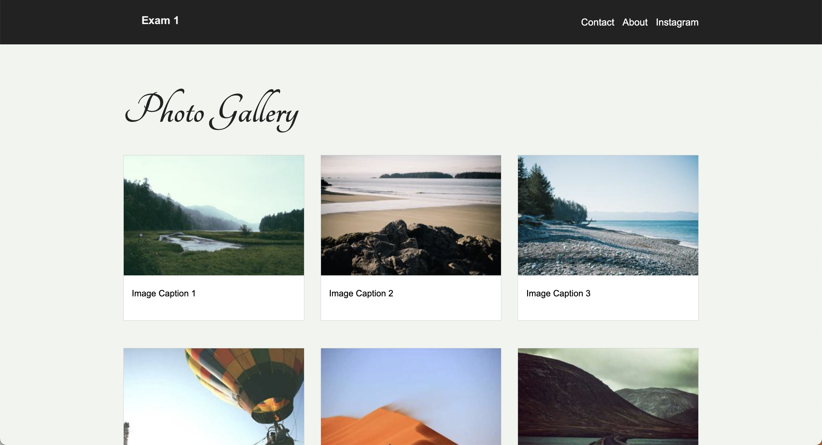
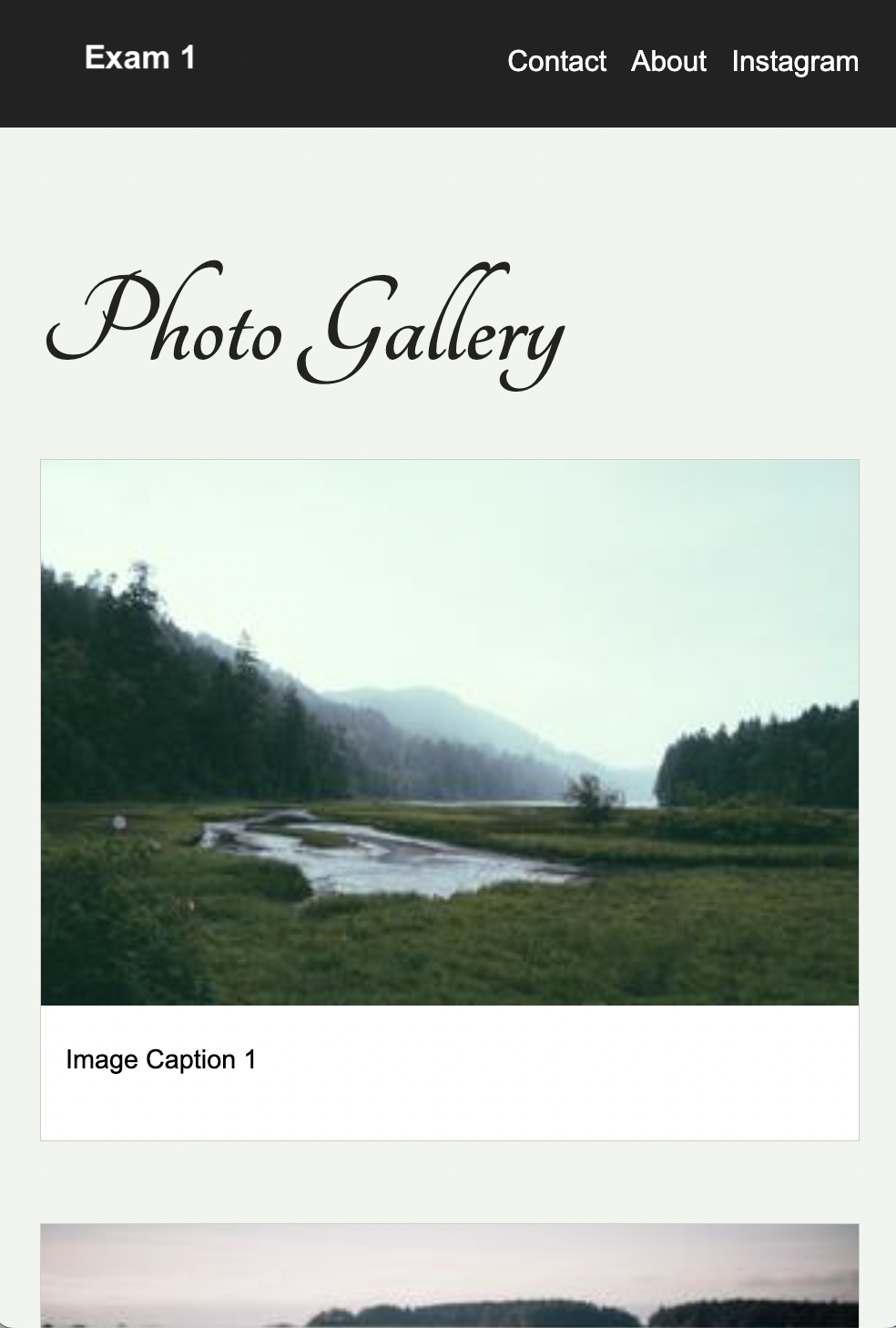
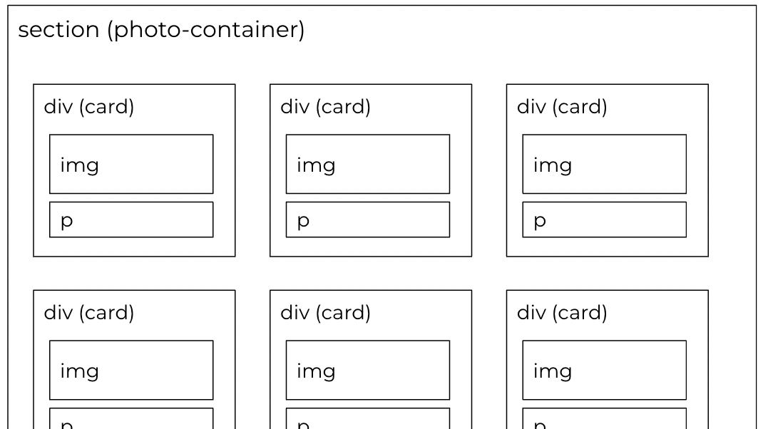
You are going to build the webpage pictured below. Partial credit will be given.
Desktop
Mobile
Part 1: Setup
-
Open your entire
csci344directory in VS Code -
Create a new folder inside of
csci344calledexams. Your directory structure should looks something like this:csci344 ├── exams ├── homework ├── index.html ├── lectures ├── styles.css └── tutorials -
Download the
exam01starter files below and unzip them: -
Copy the
exam01folder into theexamsfolder you just created. -
Inside of the
exam01folder, create a brand new HTML file calledindex.htmlthat is in the root of theexam01folder (see folder structure below). -
Create a CSS file called
styles.cssthat is also in the root of theexam01folder (see folder structure below).exam01 ├── images │ ├── img1.jpg │ ├── img2.jpg │ ├── img3.jpg │ ├── img4.jpg │ ├── img5.jpg │ └── img6.jpg ├── index.html <-- Your new HTML file ├── pages │ ├── about.html │ └── contact.html └── styles.css <-- Your new CSS file -
Copy/paste the following boilerplate into
index.html(then you will edit it in Part 2):<!DOCTYPE html> <html lang="en"> <head> <meta charset="UTF-8"> <meta http-equiv="X-UA-Compatible" content="IE=edge"> <meta name="viewport" content="width=device-width, initial-scale=1.0"> </head> <body> </body> </html> -
Copy/paste the following boilerplate into
styles.css(then you will edit it in Part 3):@import url('https://fonts.googleapis.com/css2?family=Tangerine:wght@400;700&display=swap'); /* 3.1 Body */ /* 3.2 Header + nav */ /* 3.3 Custom font */ /* 3.4 Main */ /* 3.5 Gallery layout */ /* 3.6 Card styling */ /* 3.7 Footer */ /* 3.8 Media queries */
Part 2: HTML Tasks (40 Points)
Edit the index.html page as follows:
2.1. Metadata (2 Points)
- Add a
titletag inside of theheadtag, with the display text of “Exam 1”
2.2. Header Section (12 Points)
Create the header section pictured below (links should work):
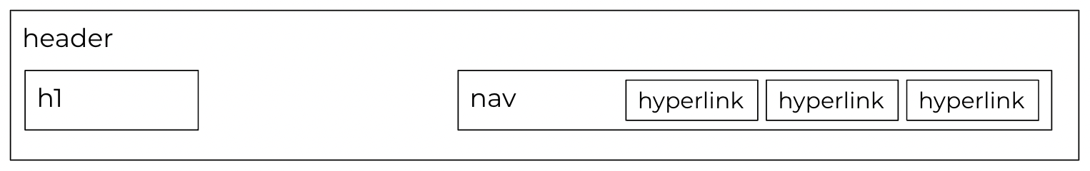
- Add a
headertag inside thebodytag (don’t get the head and the header tag confused). - Inside the
headertag, create anh1tag that displays the text “Exam 1” - Also inside the
headertag and below theh1tag, create a navigation section using thenavtag. - Inside of the
navtag, create three hyperlinks:- One that links to
contact.html(in the pages folder) with the display text of “Contact”. Use a relative path. - One that links to
about.htmlwith the display text of “About Us”. Also use a relative path. - One that links to Instagram’s home page, the display text of “Instagram”. Use an absolute path.
- One that links to
Note: you may NOT move the contact.html or about.html files outside of the pages folder.
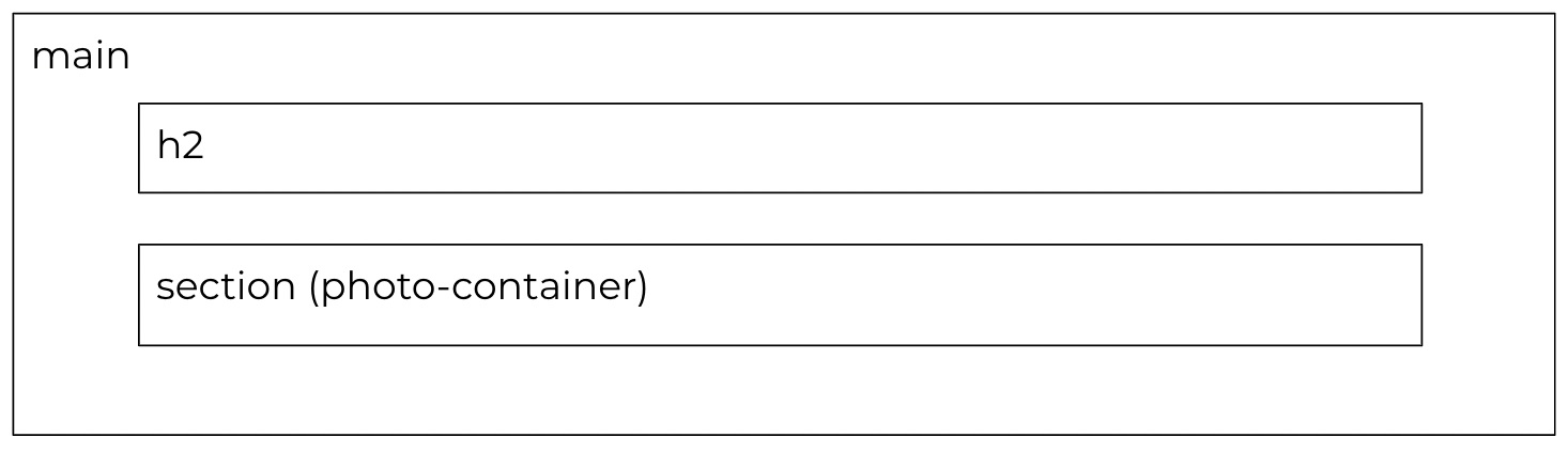
2.3. Main Section (6 Points)
- Below the
headertag, create amaintag. - Inside the
maintag, create two children:- An h2 tag with the text of “Photo Gallery”
- A section that has a class of “photo-container”.
2.4. Photo Container (16 Points)
Inside of the “photo-container” section you will make 6 div tags (one for each image).
- Each div tag should be assigned a class of
card. - Each div tag will contain an
imgtag and aptag (for the caption).- Each
imgtag will point to one of the images in theimagesfolder. - Use a relative path for each image source.
- Don’t forget to use the
altattribute to give each image a description (for people who use a screen reader).
- Each
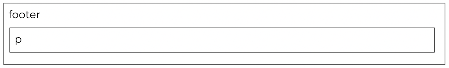
2.5. Footer (4 Points)
Create one footer section below your main section using the footer tag. Within the footer, create a paragraph tag that says “Copyright Your Name, 2026.”
Part 3: CSS Tasks (56 Points)
Edit your index.html file by adding a link to your stylesheet. Then, complete the following tasks within styles.css:
3.1. Body (4 Points)
Create some style rules for the body element:
- Set the background color to a light gray (
#F0F4EF) - Set the font family to
Arial, Helvetica, sans-serif - Set the margin to
0
3.2. Header Section (12 Points)
Style the header so that it looks like this:

-
Create some style rules for the
headerelement:- Set the background color to
#222222 - Set the height to
10vh - Set the left and right padding to
10vw
- Set the background color to
-
Create some style rules for the
h1element (and any relevant child elements) to:- Set the font color to
white - Set the font size to
1.2em
- Set the font color to
-
Create some style rules for
aelements inside thenavelement:- Set the link color to
white - Set the text decoration to
none
- Set the link color to
3.3. Custom Font (8 Points)
Use the “Tangerine” Google font to style the h2 tag. Note that the Google font has already been included in the starter styles.css. Your job is to add the following style properties to the h2 tag:
font-family: "Tangerine", cursive;
font-style: normal;
3.4. Main (2 Points)
Set the left and right padding of the main tag to 10vw.
3.5. Gallery Layout (10 Points)
Create some style rules for the photo-container class that implement the following requirements:
- Use CSS Grid
- Define three evenly spaced columns
- Create a column gap and row gap of
30px.
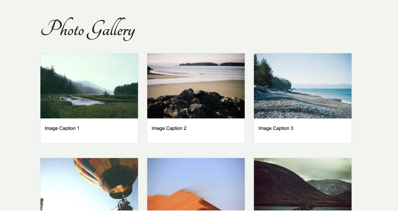
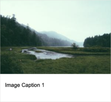
3.6. Card Styling (10 Points)
Create some style rules for the card class that implement the following requirements:
- The background should be white
- The border should be solid and light gray
- The image contained inside the card should span the full width of its container (the div)
- The caption should not be too close to the sides of the div
3.7. Footer (2 Points)
Create some style rules to set the footer’s background color to #222222, and the footer’s text color to white.
3.8. Responsive Design with Media Queries (8 Points)
When the width of the screen is less than 700px, the photo-container section should have one column as shown below:
Part 4: Accessibility Tasks (4 Points)
Run the WAVE extension and make sure there are no accessibility issues. Correct any issues that you find.
What to Submit
Please read carefully: Double-check your work to make sure you’ve completed all of the tasks. Then, update your homepage by adding a link to the index.html page you just completed (see Sarah’s homepage for an example). After committing and syncing your changes to GitHub, paste a link to your homepage on GitHub pages into the Moodle.
- If your GitHub is not working for whatever reason, just zip your COMPLETED
exam01folder and upload it to the Moodle.