Assignments > Tutorial 5b: Hamburger Menu
Due Mon, 02/23 at 11:59pm
The goal of this exercise is to build a “hamburger menu” from scratch and toggle it with JavaScript.
1. Set-up
Please create a new folder inside of tutorial05 called 02-hamburger-menu
1.1. Create the HTML
Inside of 02-hamburger-menu, create a new index.html file. Then, paste the following starter code into it:
<!DOCTYPE html>
<html lang="en">
<head>
  <meta charset="UTF-8" />
  <meta name="viewport" content="width=device-width, initial-scale=1.0" />
  <title>Hamburger Menu</title>
</head>
<body>
  <nav class="navbar">
    <h1>Logo</h1>

    <button id="menu-toggle" class="menu-toggle">
      <span class="bar"></span>
      <span class="bar"></span>
      <span class="bar"></span>
    </button>

    <ul id="nav-links" class="nav-links">
      <li><a href="#">Home</a></li>
      <li><a href="#">About</a></li>
      <li><a href="#">Services</a></li>
      <li><a href="#">Contact</a></li>
    </ul>
  </nav>
</body>
</html>
1.2. Add CSS
Create styles.css and start with:
body {
  font-family: Arial, sans-serif;
  margin: 0;
  padding: 0;
  background-color: #f4f4f4;
}

body * {
  box-sizing: border-box;
}

.navbar {
  padding: 0 20px;
  display: flex;
  justify-content: space-between;
  align-items: center;
  background: #333;
  color: white;
  height: 80px;
}

.nav-links {
  list-style: none;
  display: flex;
  gap: 16px;
  margin: 0;
  padding: 0;
}

.nav-links a {
  color: white;
  text-decoration: none;
}

.bar {
  display: block;
  width: 24px;
  height: 3px;
  margin: 4px 0;
  background: white;
}
1.3. Connect Your Stylesheet
Link the stylesheet you just made in <head>:
<link rel="stylesheet" href="styles.css" />1.4. Preview the starter code
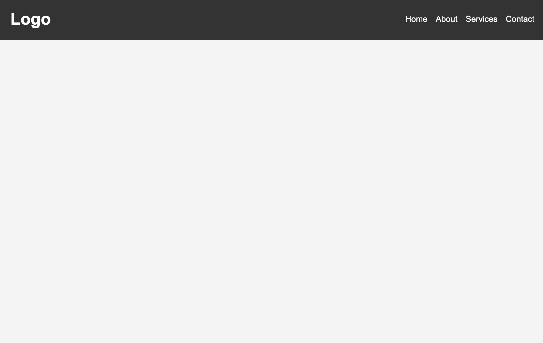
Now, preview index.html in the browser (using Live Server). You should notice that there is a hamburger menu floating in the middle:
In the next section your job will be to make the website smarter:
- For Desktop displays: Don’t show the hamburger menu but do show the navigation.
- For Mobile displays: Do show the hamburger menu but don’t show the navigation.
2. Responsive CSS: Showing / hiding elements based on screen size
2.1. Add some conditional CSS using Media Queries
.menu-toggle {
  display: none;
  border: 0;
  background: transparent;
  cursor: pointer;
}

@media (max-width: 768px) {
  .menu-toggle {
    display: block;
  }

  .nav-links {
    display: none;
    position: absolute;
    top: 80px;
    right: 0;
    width: 220px;
    flex-direction: column;
    background: #333;
    padding: 12px;
  }

  .nav-links.active {
    display: flex;
  }
}
2.3. Preview the page again
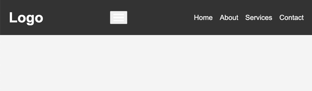
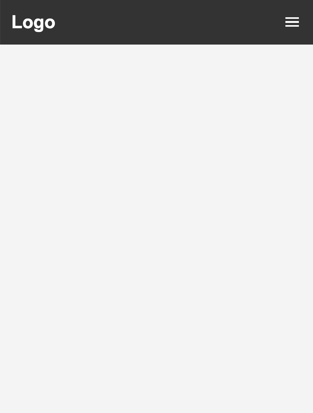
Please open the HTML page again in the Browser. You should now notice that:
- When the page is in Desktop mode, the hamburger button does not display.
- When the page is in Mobile mode, the hamburger button does display but the navigation does not.
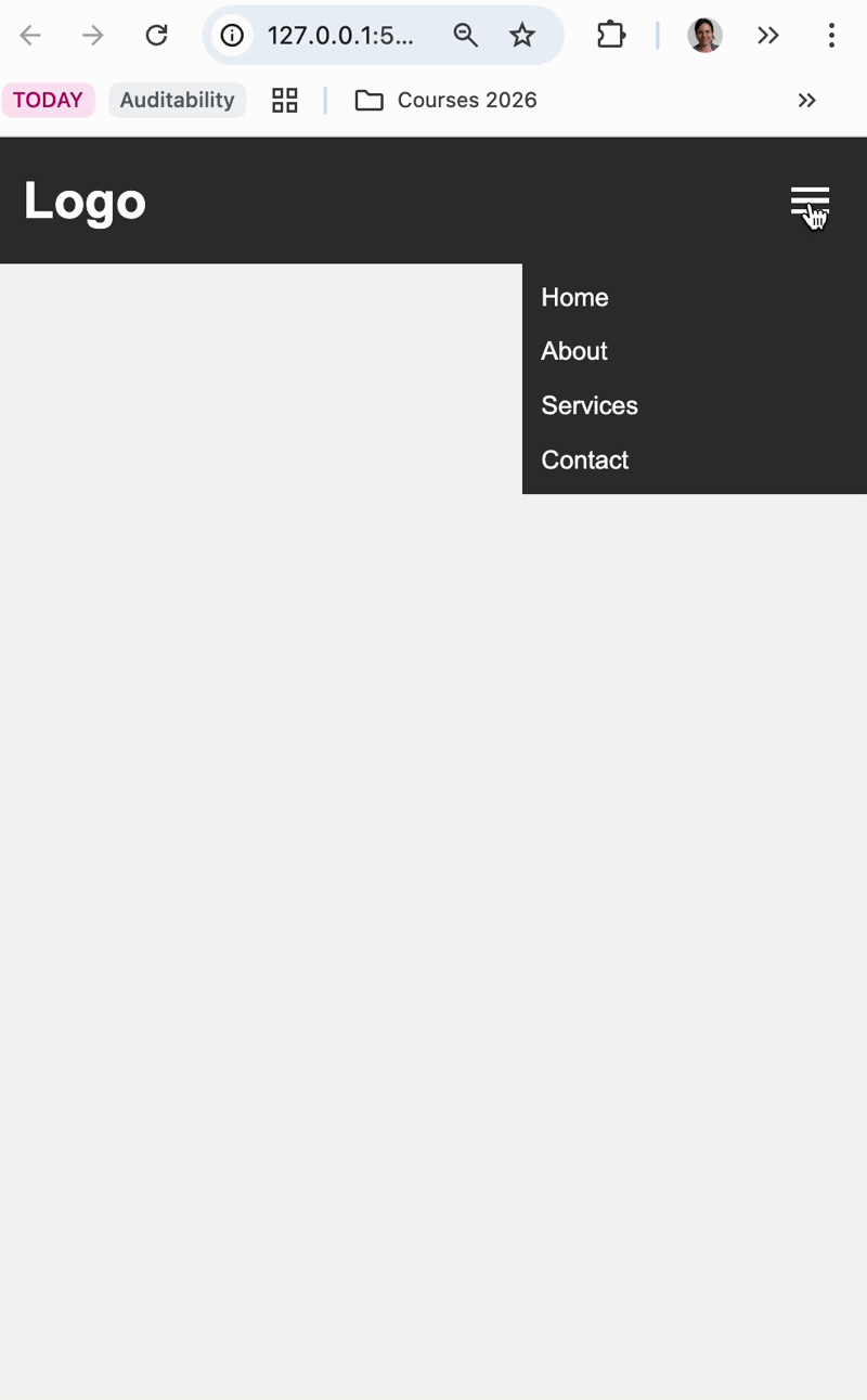
In the next section your job will be to make the menu appear on the mobile layout when you click the button. To do this, you will add and remove the ‘active’ class on both the button and the menu.
3. Add JavaScript
Create index.js, link it in <head>, and create a toggleMenu() function.
3.1. Create and link your JavaScript
Create a new file called index.js. Then link it to your HTML within the <head> tag
<script src="index.js" defer></script>3.2. Create the toggleMenu() function
Create a new toggleMenu function() whose job is to:
- Target the menu with id
nav-links. - Use the element’s classList function to toggle the “active” class on and off.
Skeleton to guide you:
function toggleMenu() {
  // 1) target menu
  // 1) toggle 'active' on menu
}
When you’re done, don’t forget to attach the function to the event that should trigger it inside the HTML (notice the onclick attribute below):
<button id="menu-toggle" class="menu-toggle" onclick="toggleMenu()">
    ...
</button>
3.3. Test
- Resize browser to mobile width.
- Click the hamburger button.
- Verify first click opens menu and second click closes it.