Assignments > Tutorial 4b: Instagram High-Fidelity Design & Style Guide in Figma
Due Wed, 02/18 at 11:59pm
Overview
Now that you’ve created your low-fidelity prototype, you are going to practice creating a “high-fidelity” prototype. In practice, high-fidelity prototypes serve two purposes:
- They provide a way for designers to give instructions to developers: “This is what you need to build.”
- They can also be used to generate “design tokens” – which are JSON files that can generate style variables for CSS and other native styling languages.
In this activity, you will complete three tasks (inspired by this video tutorial):
- Create a high-fidelity prototype
- Create Figma Styles
- Generate a style guide using a Figma plugin
Tips
- Design first, extract later - Focus on making your design look good, then extract the styles
- Use consistent colors - This makes it easier to create styles later
- Keep it simple - You don’t need to recreate every detail of Instagram
- Reference Instagram (Optional) - If you have an Instagram account, look at the real app for color and spacing ideas
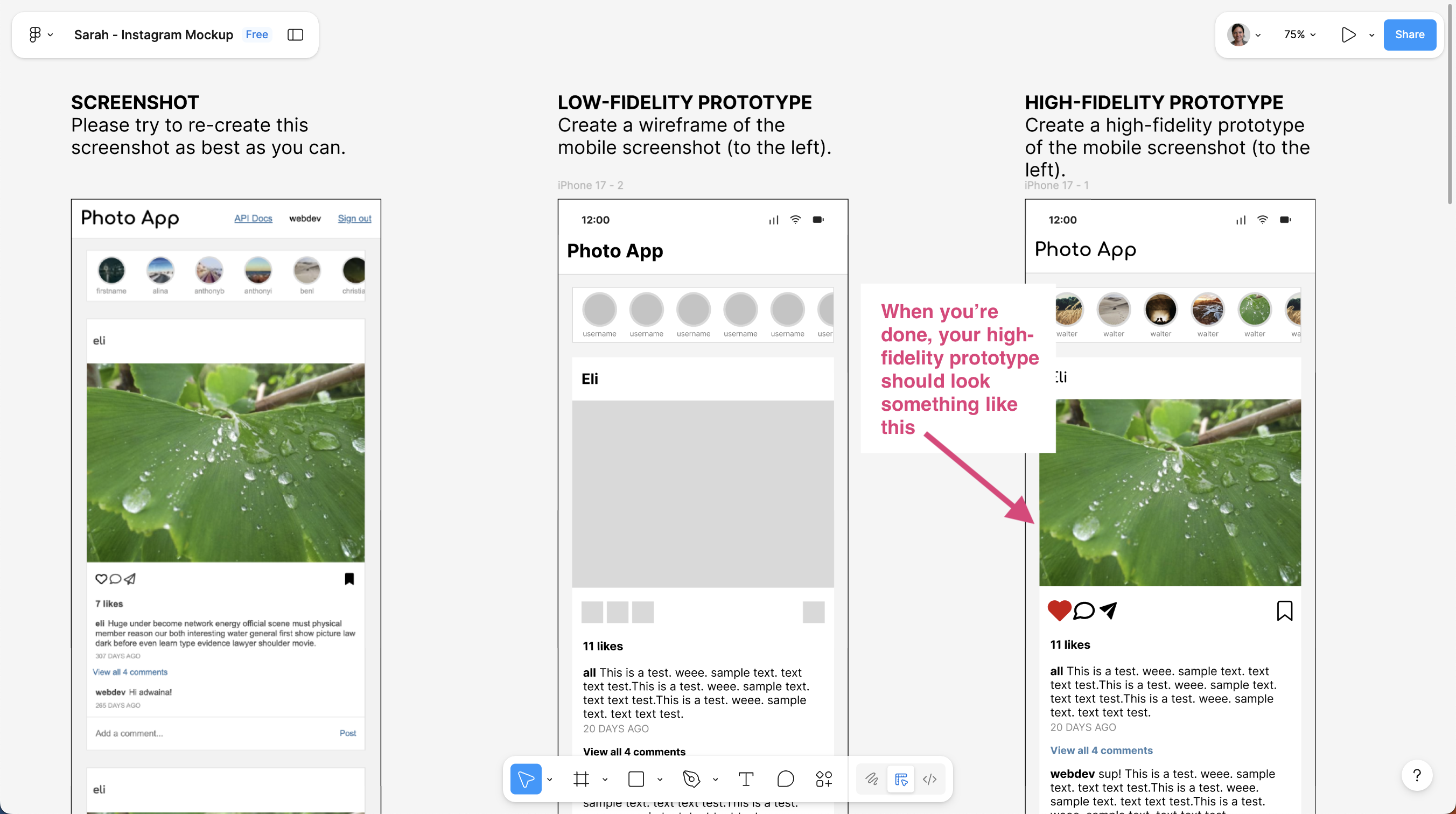
1. Create a High-Fidelity Prototype
Transform your wireframe from Day 1 into a polished, high-fidelity design. Choose either mobile OR desktop (not both).
1.1. Open your wireframe on Figma
Open your wireframe file from Day 1 and select either the mobile (375px) or desktop (1200px) feed screen.
1.2. Make a copy of your wireframe Frame
After selecting you preferred layout (mobile or desktop):
- Make a copy of the the entire low-fidelity frame
- Paste a duplicate to the left or right of the original frame.
- Give your copy a different name in the left-hand navigator.
- Begin converting it to a high-fidelity prototype.
Here is how Sarah laid our her Figma page:
1.3. Add colors
- Use the Eyedropper tool (I) to sample colors from Instagram, or use the color picker
- Apply colors to backgrounds, text, and interactive elements
- Use Instagram’s color palette: white, light gray, black/dark gray, blue (links), red (likes)
1.4. Add typography
- Set font sizes: 12px (captions), 14px (body), 16px (headings)
- Set font weights: Regular, Medium, Bold
- Use system fonts (Inter, sans-serif) for body copy and Comfortaa for the top-level headers.
1.5. Add visual polish
- Profile pictures: Make circles, add borders
- Icons: Use simple shapes or text symbols (heart, comment, share)
- Image placeholders: Add some real images.
- Consistent spacing (8px, 16px, 24px) between elements
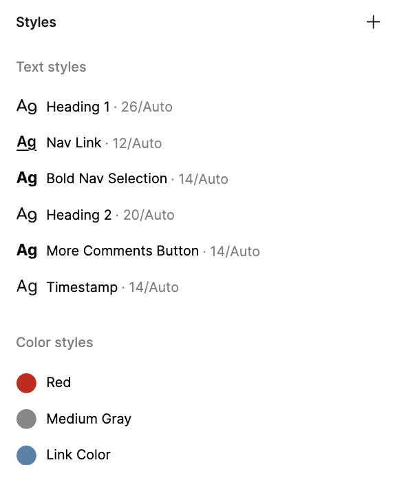
2. Create Figma Styles
Now extract the colors and typography you used into Figma Styles. Styles are reusable design tokens that can be applied across your design.
Video Walkthrough
If you need a hint, I have recorded a video walkthrough to show you how to create the styles.
2.1. Create Color Styles:
-
Select an element that uses a color you want to save (e.g., a background rectangle, text element)
-
Create a color style:
- In the right panel, click the color swatch (for fills) or text color (for text)
- Click the ”+” icon next to “Styles” (or the four-dot icon)
- Name it (e.g., “Background”, “Text Primary”, “Accent Blue”)
- Click “Create style”
-
Repeat for all your colors:
- Select different colored elements and save each as a style
- Create styles for: Background, Text Primary, Text Secondary, Accent Blue, Accent Red, etc.
- Create at least 3 color styles
2.2. Create Text Styles
-
Select a text element that has the typography you want to save
-
Create a text style:
- In the right panel, click the text style dropdown (shows “None”)
- Click the ”+” icon
- Name it (e.g., “Body Text”, “Body Text Bold”, “Caption”)
- Click “Create style”
-
Repeat for different text types:
- Select text elements with different sizes/weights and save each as a style
- Create styles for: Body Text (14px, Regular), Body Text Bold (14px, Bold), Caption (12px, Regular)
- Create at least 3 text styles
Tip: Once created, you can apply styles to other elements by selecting them and choosing the style from the dropdown in the right panel.
Once you’re done, you will be able to see the styles you create at the bottom of the right-hand panel (just make sure that no elements are selected). Your styles panel should look something like this:
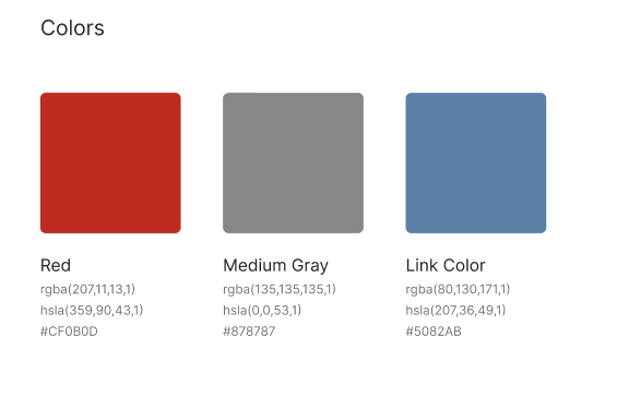
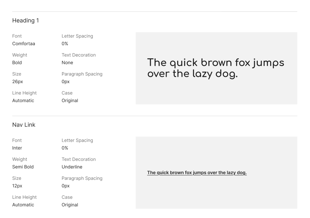
3. Generate Style Guide with Plugin
Use the “Automatic Style Guide” plugin to automatically generate a style guide from your design.
3.1. Install the Plugin:
- In Figma, go to Menu → Plugins → Browse plugins in Community
- Search for “Automatic Style Guide”
- Click “Install” (or “Run” if already installed)
3.2. Use the Plugin:
-
Run the plugin:
- Go to Menu → Plugins → Automatic Style Guide
- The plugin will scan your design for colors, typography, and styles
-
Generate the style guide:
- Follow the plugin’s prompts
- It will create a new frame or page with your style guide
- The style guide will include:
- Color palette
- Typography system
- Spacing (if detected)
-
Review and organize:
- Check that all your colors and typography are captured
- Add labels or descriptions if needed
Your style guide should look something like this (just a few screenshots):
Checklist
What to turn in
- Update your Figma file permissions so that anyone with the link can view your Figma file.
- Copy the link to Figma.
- Create a link from your homepage to your Figma file (see Sarah’s homepage for an example).
- Commit and push your edits to your homepage to GitHub and, paste a link to your GitHub Repository and to your GitHub pages in the Moodle submission.