Assignments > Tutorial 3: CSS Frameworks (Tailwind)
Due Mon, 02/09 at 11:59pm
About Today’s Tutorial: Today’s tutorial is based on the Get Started With Tailwind CSS video tutorial by John Komarnicki. If you would like additional context / explanation, please check out the video!
- Here are today’s introductory slides.
Suggested Readings
- [Theory] Design Systems 101: An Introductory Guide
- [Theory] By The Numbers: A Year and Half with Atomic CSS: How design systems improve efficiency
- [Practice] Tailwind Cheatsheet
Set Up & Configuration
Most practicing front-end developers use frameworks to help them organize and maintain their HTML, CSS, and JavaScript files. In this class, we will be using Node.js to help us manage various client-side frameworks.
You already installed Node.js during the first week of CSCI344. When you did this, you installed:
- A JavaScript engine (specifically, the V8 JavaScript Engine that powers Chrome)
- A built-in package manager,
npm– to manage and install dependencies
These tools, among other things, provide a way to “transpile” higher-level languages (e.g., TypeScript, SCSS, CoffeeScript, React, etc.) into “vanilla” HTML, CSS, and JavaScript
Today, we’re going to try using Node.js to help us work with a third-party CSS library and design system called Tailwind. Please follow the set up and configuration instructions below so that you can complete the tutorial.
Download the tutorial03.zip file, unzip it and move the unzipped tutorial03 folder into the csci344/tutorials folder (see diagram below).
csci344
    |-- tutorials
    │   |-- tutorial02
    │   |-- tutorial03
    |   ...
    |
    |-- homework
    │   |-- hw02
    |   ...
    |
    |-- lectures
        |-- lecture03
        |-- lecture05
        |-- lecture06
        ...
1. Create a node.js application
- Open your entire
csci344directory in VS Code - Then, open your terminal in VS Code (
View >> Terminalin the top menu). - Use the
cdcommand to navigate to yourtutorial03directory (within yourcsci344directory) in your terminal. - Verify that you’re in the
tutorial03directory by typingpwd. - Finally, initialize a new node project as follows:
npm init -y
Attention Windows Users
If this command give you an error, there may be a permissions issue. One of the students in the class solved this issue by opening a PowerShell window as an administrator and running the following command:
Set-ExecutionPolicy RemoteSignedAfter you run this command, try runningnpm init -yagain.
If you did this correctly, a package.json file should have been created at the root of your tutorial03 directory. package.json is a configuration file that helps you to (among other things):
- Keep track of various dependencies that you install to make a client-side web app, and
- Run various testing and compilation scripts on the command line.
npm stands for “node package manager.” We will be using npm to install and keep track of dependencies that we will pull down from the Internet.
2. Install the Tailwind library
Next, you will install the Tailwind library by issuing the following command on the terminal:
npm install -D tailwindcss @tailwindcss/cli
mkdir public
This command asks the node package manager to go out to the Internet and download the tailwind.css library and any additional dependencies that tailwind requires. When the download is complete, you should notice that a node_modules directory has been created inside of tutorial03, which contains the third-party modules (tailwind and some dependencies) that you just downloaded from the Internet. We’ll talk more about this in the coming weeks.
Pro Tip: Typically, you exclude third-party packages (like the ones in your
node_modulesfolder) from version control. To do this in git, create a.gitignorefile and specify all of the files and folders that you do not want to track. Note that this has already been done for you: if you open thetutorial03/.gitignorefile in VS Code, you can see that.gitignorehas excluded thenode_modulesfolder.
3. Start the Tailwind Bundler
npx tailwindcss -i ./src/input.css -o ./public/output.css --watchThis script will rebuild your public/output.css CSS file every time you save an HTML file. So, as you add various tailwind classes to your index.html file, a new version of your stylesheet will be generated in public/output.css. Keep the terminal open so that this script can continue doing its job. It has to be running while you add classes to your HTML file.
Tips on the Tailwind bundler:
- The bundler command must be running in order for your Tailwind stylesheet to build correctly (
public/output.css).public/output.cssis auto-generated by the bundler (do not edit it or your edits will be overwritten).
4. Link your “bundled” Tailwind stylesheet
Finally, add a link from your index.html file to your auto-generated Tailwind stylesheet (public/output.css) by adding the following link within the <head> tag of your index.html file:
<link rel="stylesheet" href="./public/output.css">Your entire index.html file should look something like this (ensure that your stylesheet link looks correct):
<!DOCTYPE html>
<html lang="en">

<head>
    <meta charset="UTF-8">
    <meta name="viewport" content="width=device-width, initial-scale=1.0">
    <link rel="stylesheet" href="./public/output.css">
    <title>Tutorial 3: Tailwind</title>
</head>

<body></body>

</html>
5. Install Tailwind CSS IntelliSense
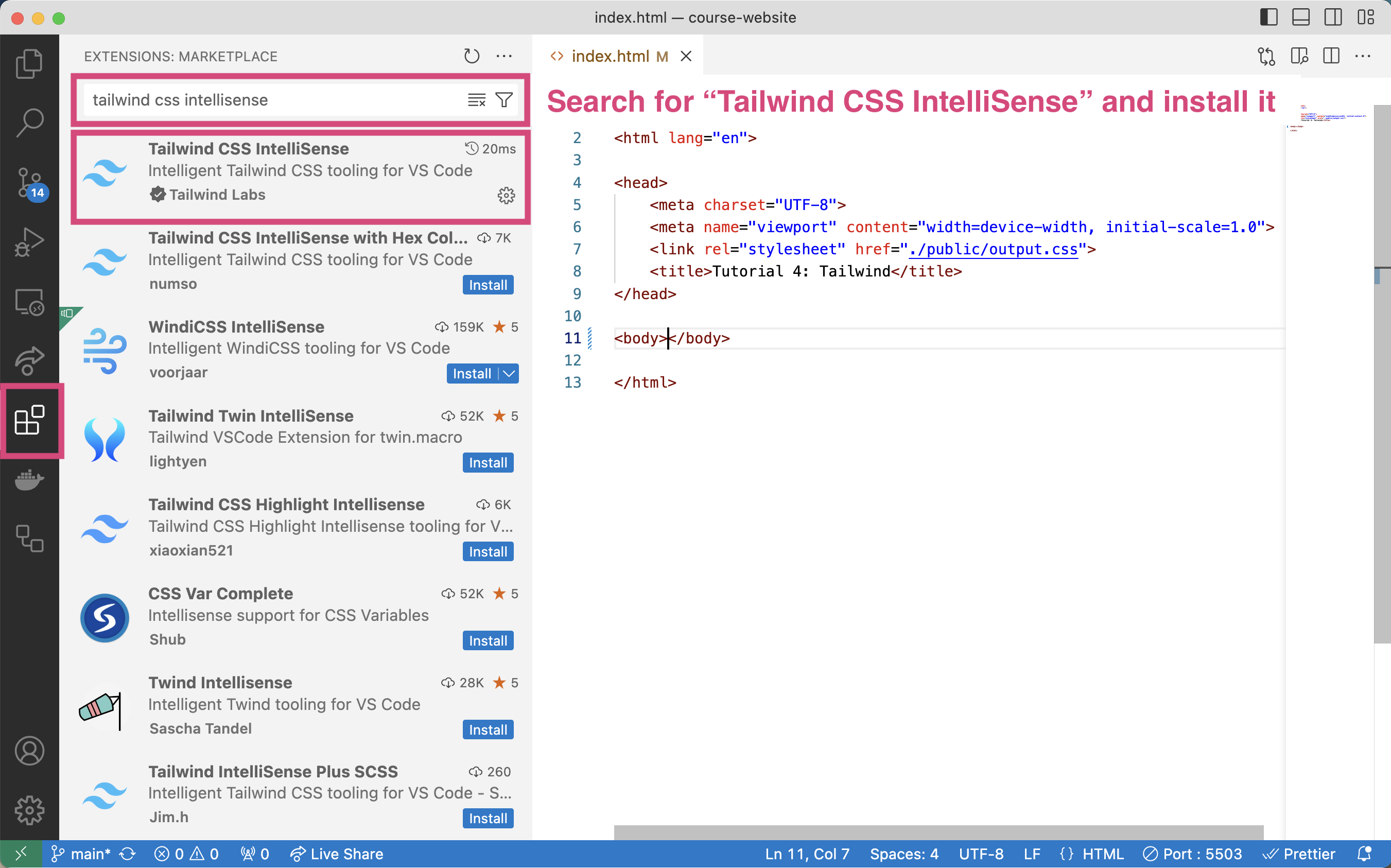
Finally, to make it more convenient for you to use the Tailwind library, please install the “Tailwind CSS IntelliSense” extension in VS Code. You will click the “Extensions” icon (left toolbar, looks like 4 squares), search for “Tailwind CSS IntelliSense”, and install it:
Configuration Summary
To recap what you’ve done, you:
- Created a new Node.js project (
npm init -y) - Installed the dependencies (external JavaScript libraries) that allow you to work with tailwind (
npm install -D tailwindcss @tailwindcss/cli) - Ran the tailwind bundler to automatically build your
public/output.cssfile as you make changes to yourindex.htmlfile (npx tailwindcss -i ./src/input.css -o ./public/output.css --watch). - Linked your
index.htmltopublic/output.css - Installed the “Tailwind CSS IntelliSense” extension to make coding easier.
Great work! You are on your way to becoming a skillful web developer, and you are now ready to begin working with Tailwind!
Note: While this process no doubt seems complicated, it will become simpler over time as you become more familiar with Node.js and various client-side libraries. Node.js has a bit of a learning curve, but will save you so much time later on!
Your Tasks
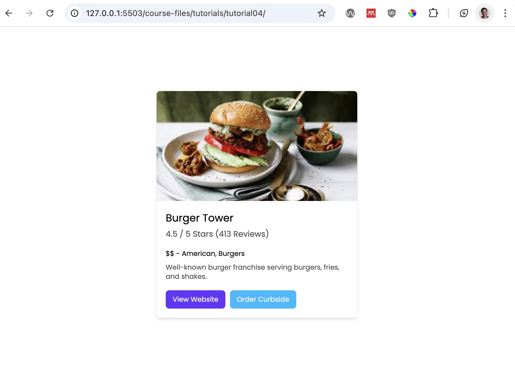
To get a sense of what the Tailwind CSS library offers, you are going to create the following “card” using the Tailwind CSS classes. When your done, your index.html file should produce this web page:
1. Add the starter HTML code
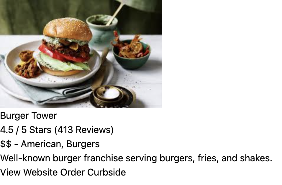
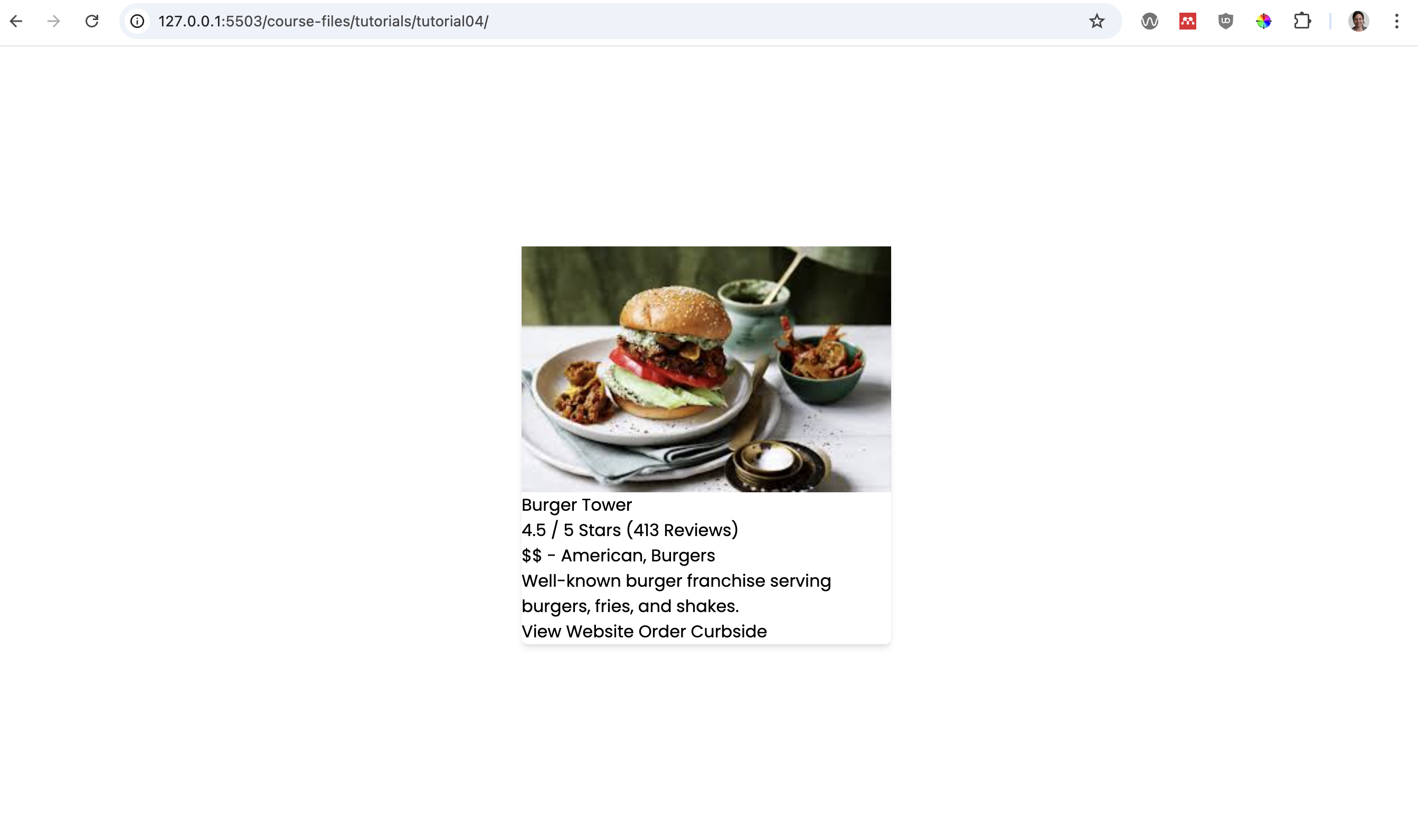
Let’s start our Tailwind experiment by pasting the code block below within the body tag of our index.html file. These are the HTML instructions for producing an “unstyled” card:
<div> <!-- top-level container (for centering the card)-->
    <div> <!-- card container -->
        <img src="./assets/burger.jpg" alt="burger dish" />
        <!-- text container-->
        <div>
            <h2>Burger Tower</h2>
            <h3>4.5 / 5 Stars (413 Reviews)</h3>
            <p>$$ - American, Burgers</p>
            <p>
                Well-known burger franchise serving burgers, fries, and shakes.
            </p>

            <!-- button container-->
            <div>
                <button>View Website</button>
                <button>Order Curbside</button>
            </div> <!-- end button container-->
        </div> <!-- end text container-->
    </div> <!-- end card container -->
</div> <!-- end top-level container -->
After adding the above code within the body tag, go ahead and preview your index.html file in the browser using live server. It should look something like this:
2. Make some Tailwind customizations
Although Tailwind comes with a baseline set of styles, you can override them as you like in order to customize the look and feel of your website. Let’s make a few customizations:
First, let’s use the Poppins font from Google Fonts. Add the following line to the top of your src/input.css file (before your Tailwind directives):
@import url("https://fonts.googleapis.com/css2?family=Poppins:wght@400;500;600;700;800;900&display=swap");Your src/input.css stylesheet should now look like this:
@import url("https://fonts.googleapis.com/css2?family=Poppins:wght@400;500;600;700;800;900&display=swap");
@import "tailwindcss";
@config "../tailwind.config.js";
Once you’ve done this, you’re going to make some changes to your tailwind.config.js file’s theme property as follows:
theme: {
    extend: {
        colors: {
            "custom-blue": "#00BAFF",
            "custom-purple": "#6336FA",
        },
    },
    fontFamily: {
        Poppins: ["Poppins"],
    }
}
By making these changes, you’re expanding the available fonts and colors that Tailwind has available to it. When you’re done, your tailwind.config.js file should look like this:
module.exports = {
    content: ["./*.html", "./src/**/*.{html,js}"],
    theme: {
        extend: {
            colors: {
                "custom-blue": "#00BAFF",
                "custom-purple": "#6336FA",
            },
        },
        fontFamily: {
            Poppins: ["Poppins"],
        },
    },
    plugins: [],
};
3. Center the card
As you may recall from Tutorial 2, to center the child, you need to set some style properties on the parent (usually either flex or grid). Given this, you will add the following classes to the outermost div:
- font-Poppins (which you just defined in your
tailwind.config.jsfile) - flex
- flex-col
- justify-center
- items-center
- min-h-screen
Please look at the Tailwind documentation to read about what each of these classes does. When you’re done, your outer-most div should look like this:
<div class="font-Poppins flex flex-col justify-center items-center min-h-screen">
    ...
</div>
Essentially, you’ve created a more “semantic” way of specifying a flex layout (where children are centered horizontally and vertically) that is easy for someone else to read and understand.
4. Add styling to the card
Now you will add styling to the div that holds all of the card information by adding the following Tailwind classes:
- max-w-[350px] (note that there are some standard styles, but you can also define your own by surrounding a custom unit with hard brackets)
- flex
- flex-col
- shadow-md
- rounded-md
When you’re done with steps 1-4, your page should look like this…
…and your code should look something like this…
 <div class="font-Poppins flex flex-col justify-center items-center min-h-screen">
    <div class="flex flex-col max-w-[350px] shadow-md rounded-md">
        ...
    </div>
</div>
5. Style the image
Add the following Tailwind classes to the image…
- max-h-56
- object-cover
- rounded-t-md
…and then preview your image. You should see the height of the image change, and the corners should now be rounded.
6. Style the rest of the content
Now that you get the basic idea, style the rest of the card using the following styles (see screen shot below):
If you’ve done everything correctly, your page should now look completed:
7. Simplify the buttons
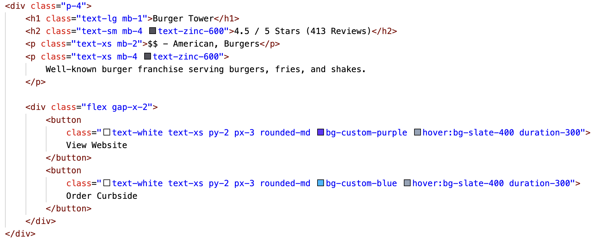
One last thing to note in this tutorial is that sometimes you may find yourself writing repetitive code. For instance, the two buttons you just made have many of the same classes:
<button
    class="text-white text-xs py-2 px-3 rounded-md bg-custom-purple hover:bg-slate-400 duration-300">
    View Website
</button>
<button
    class="text-white text-xs py-2 px-3 rounded-md bg-custom-blue hover:bg-slate-400 duration-300">
    Order Curbside
</button>
In fact, both buttons use all of these classes:
text-white text-xs py-2 px-3 rounded-md hover:bg-slate-400 duration-300
The only difference between them is the class used to specify their background color.
Given this, Tailwind allows you to use something called the @apply directive to create higher-level CSS classes that abstract repetitive class combinations. To do this, open your src/input.css file and paste the following line of code below the @tailwind directives:
.btn {
    @apply text-white text-xs py-2 px-3 rounded-md hover:bg-slate-400 duration-300;
}
Now go to your index.html file and modify the two buttons as follows:
<button class="btn bg-custom-purple">View Website</button>
<button class="btn bg-custom-blue">Order Curbside</button>
This is much easier to read, and keeps you from repeating yourself.
8. Takeaways: Is this really a better way to do things?
One thing you might be thinking is “geee, this is really repetitive and tedious!” Particularly if you’ve been hand-coding CSS for a while, this approach may seem pretty verbose. But consider the following “real world” scenarios:
- Eventually, someone will have to learn your CSS system / conventions, which is also time consuming (and likely far less consistent than a framework)
- If your new developer already knows Tailwind, they can hit the ground running without any learning curve (at least on the CSS side of things).
- The developers of Tailwind and other design systems have spent years abstracting common design patterns so you don’t have to. The framework will ultimately save time.
- Some design systems are cross-platform (iOS, Android, etc.) – so once the design team creates the customized Tailwind theme, each team (web team, iOS team, etc.) can apply the same rules and classes for a consistent, cross-platform look and feel.
Recommended Tasks (Optional)
If you think that front-end web dev might be something you’d like to pursue, I recommend that you spend a little more time with the Tailwind framework by looking at some pre-made templates and widgets. Here’s a suggested set of tasks:
Browse some of the free Tailwind widget / theme websites:
Try to find some HTML snippets common widgets (such as the ones listed below), and paste them into the
get_creative.htmlwebpage:
- A header / nav bar
- A landing section (sometimes called a “Hero Section”)
- A card
- A footer
Try to customize the colors, widths, etc. of the frankenstein page you just made.
If you want to take a look at a sample, take a look at Sarah’s Tailwind experiments.
What to Turn In
Please create a link from your homepage to your completed tutorial 3 (see Sarah’s homepage for an example). Then, commit and push all of your edits to GitHub and, paste a link to your GitHub Repository and to your GitHub pages in the Moodle submission.
- If you collaborated with someone, please list your partner’s name in the comments section.