Assignments > HW2: Make the Photo App Interface: Part I
Due on Fri, 09/20 @ 11:59PM. 25 Points.
Collaboration and Code Sharing Policy: Read Carefully
For this homework, you are welcome to work in pairs (optional). Even if you collaborate with someone else, you must still submit your own HTML and CSS files on Moodle. If you collaborate, you’ll just list your partner in the comments section of Moodle.
For those of you who are collaborating, please do not (a) “free ride” on your teammates or (b) enable free riders. Everyone in your group should understand every line of code they submit.
In this assignment, you will create a high-fidelity prototype of a photo sharing app using HTML & CSS. You will complete all of the requirements and then submit your assignment via a zip file to the course Moodle.
Part 1: Setup
1. Create two files
Create a folder called homework. Inside of it, create a folder called hw02. Inside of it, create two files – an HTML file called index.html and a CSS file called styles.css.
When you’re done, your directory structure should look something like this:
csci344
├── homework
│   └── hw02
│       ├── index.html
│       └── styles.css
├── index.html
├── lectures
│       ...
└── tutorials
        ...
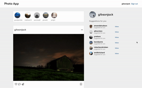
Part 2: Build the PhotoApp Interface
Using HTML & CSS (no JavaScript yet), you are going to build a webpage that looks like this:
Desktop Version

|
|
|
|
Mobile Version
Same as the desktop version, except that the recommendations panel is hidden (e.g. display: none;)
|
|
|
The webpage is composed of 4 components: a navigation bar, a recommendations, panel, a “stories” panel, and a series of cards that display a user’s post and associated comments. Your web page should look nice on both mobile and desktop screens.
Requirements
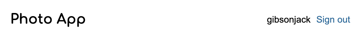
1. Navigation Bar (2 points)
- The title of the app (or logo) should be on the left-hand side
- The username and log out button should be on the right-hand side (grouped together)
- It should have a white background and some padding (so that it looks like the first figure shown below)
- Nav bar should be anchored to the top of the screen (fixed position)
The first image illustrates how the nav bar should look. The second illustrates one way of nesting HTML elements to produce the desired effect (each HTML element is outlined). Feel free to use your own approach. This is just a suggestion.

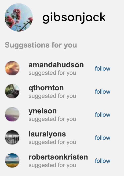
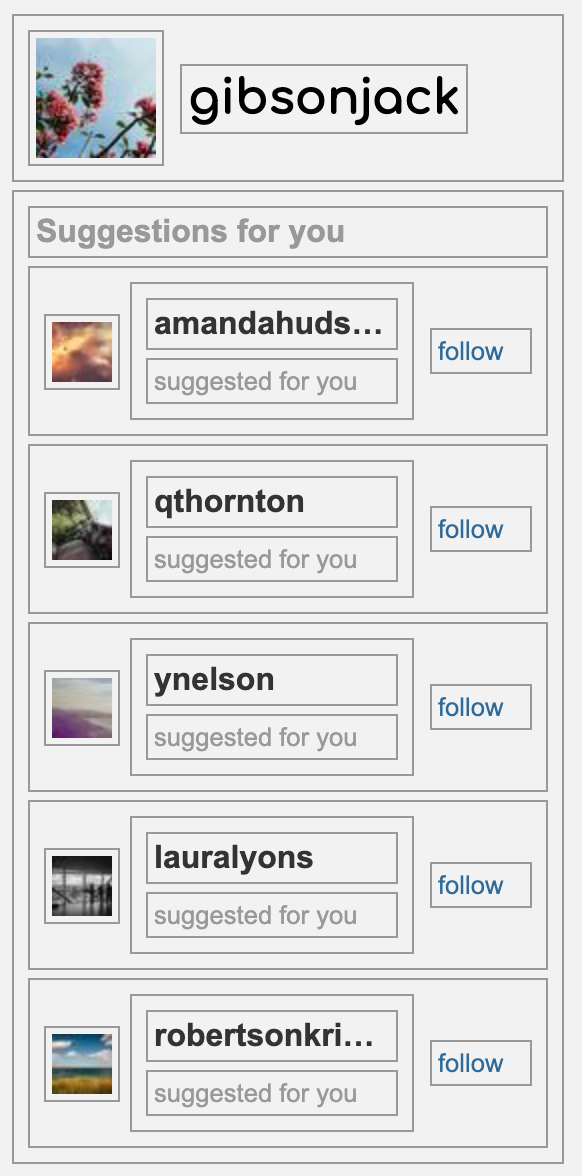
2. Recommendations Panel (4 points)
The recommendations panel suggests accounts that the user should follow. It should look like the first figure shown below. Specifically:
- A circular profile pic and a username of the current user should be at the top of the panel
- “Suggestions for you” text should be underneath the user profile
- 5 suggested accounts (use any names / pics you want) should be present
- Each suggested account should be displayed horizontally with a photo, username (with “suggested for you” below the username), and link to “follow” the user; the “follow” link should be blue but not have an underline
Tips
- Consider using the placeholder image generator found here: https://picsum.photos/. You’re also welcome to use your own images. Up to you.
- The second image below (with the boxes) illustrates one way of nesting HTML elements to produce the desired effect (each HTML element is outlined). In it:
- The “suggestion container” is a div that holds a user’s picture, name, and a button
- The “suggestion container is in “grid mode” and has a layout of:
grid-template-columns: 80px auto 80px
Feel free to use your own approach. This is just a suggestion.
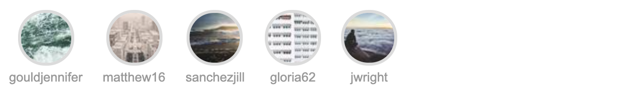
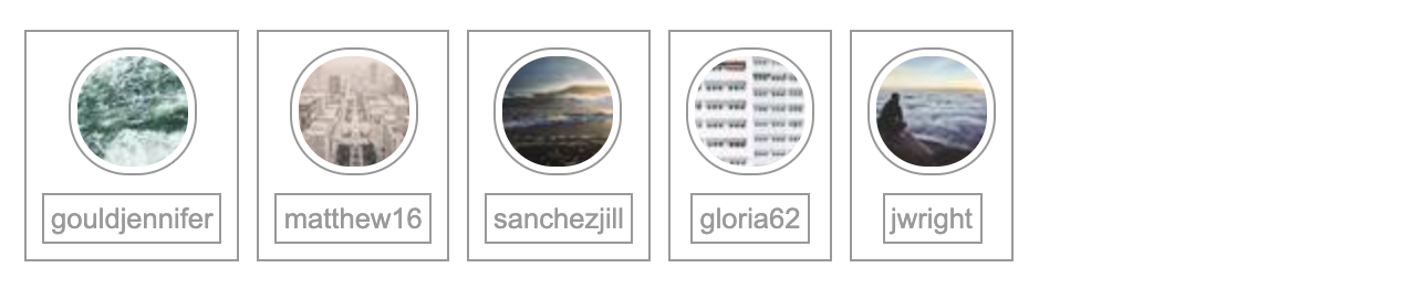
3. Stories Panel (3 points)
The stories panel displays stories of accounts that the user follows. It should look like the first figure shown below. Specifically:
- Each story should be represented by a circular profile pic on top and a username underneath
- There should be 5 stories displayed
- All of the stories should be left-justified
The second image (below) illustrates one way of nesting HTML elements to produce the desired effect. Feel free to use your own approach. This is just a suggestion.
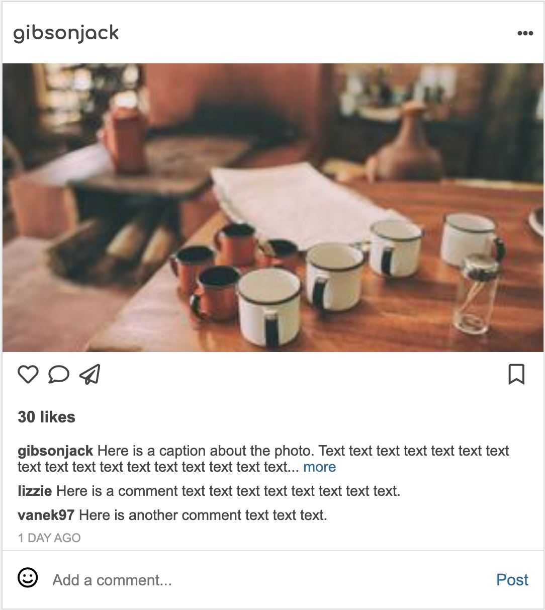
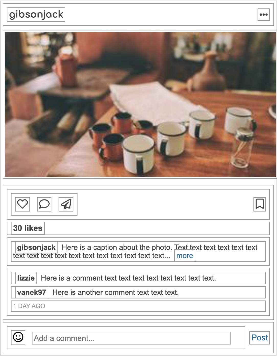
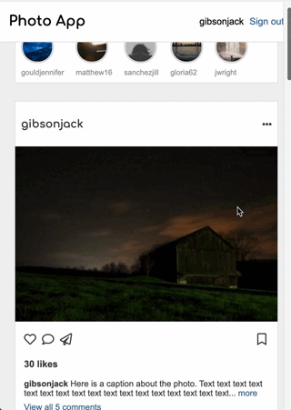
4. Card (7 points)
The card represents a post in your photo sharing app. It is the most complicated widget in your webpage, consisting of the username of the person who posted the image, the image itself, a caption, buttons, a list of comments, and the ability to post a comment. It should look like the first figure shown below. Specifically:
- The top of the card should have the creator’s username and an icon with 3 dots
- The picture should be displayed below the username
- There should be a row of icons (heart, comment, and plane on the left; bookmark on the right) below the picture
- There should be bolded text with the number of likes below the icons
- The caption of the photo, with the creator’s username, the text of the caption, and a “more” link (respectively) should be below the likes
- Below the caption, display 2 comments with the commentor’s username and the text of the comment (as pictured)
- Finally, create an “Add a comment section” with a smiley face, a text input, and a “Post” link (as pictured)
Tips
Consider using Font Awesome to display the icons. To do this, embed the following link within the head section of your HTML file…
<html>
<head>
    <title>Photo App</title>
    <link rel="stylesheet" href="https://cdnjs.cloudflare.com/ajax/libs/font-awesome/6.2.1/css/all.min.css">
    ...
</head>
<body>
    <i class="fa-solid fa-face-smile"></i>
</body>
</html>
…and then use the documentation to find the icons you want!
The first image illustrates how each card should look. The second image illustrates one way of nesting HTML elements to produce the desired effect (each HTML element is outlined). Feel free to use your own approach.
5. Composition (5 points)
- Headings should use the Comfortaa font family. Body copy should use any sans-serif font (e.g., Arial, Helvetica, etc.)
- Arrange the 4 components as shown below
- Nav bar at the top (fixed)
- Recommendations on the right (fixed)
- Stories and posts on the left, scrollable
- There should be 4 posts showing (feel free top copy the same post multiple times, as this is just a prototype)
- Desktop view: The Navigation Bar and Recommendations Panel should stay in place as the user scrolls (see animation below)
- Mobile view: The Navigation Bar should stay in place as the user scrolls; the Recommendations Panel should be hidden (see animation below)
Desktop Interface
Mobile Interface
Same as the desktop version, except that the side panel is missing, and there is less spacing around the cards:
6. Accessibility (4 points)
- Make sure your site is tabbable: that is, all links, buttons, and form controls (if applicable) can be accessed without the use of the mouse, by simply using the tab key to get to them
- Hint: this should be automatic unless you change the CSS or are not using the appropriate tag
- Make sure font colors have sufficient contrast with the background being used
- Hint: there are a couple tools that help analyze contrast on the course’s accessibility resources
Part 3: Submit
Please consult the rubric below to ensure you have met the requirements for this assignment (all of the tasks with checkmarks next to them):
| Component / Task | Subtasks | Points |
|---|---|---|
| Nav Bar | 4 requirements | 2 |
| Recommendations Panel | 4 requirements | 4 |
| Stories Panel | 3 requirements | 3 |
| Card | 7 requirements | 7 |
| Composition | 5 requirements | 5 |
| Accessibility | 2 requirements | 4 |
| Total | 25 |
What to turn in
Please create a link from your homepage to your completed homework 2 webpage (see Sarah’s homepage for an example). Then, commit and push all of your edits to GitHub and, paste a link to your GitHub Repository and to your GitHub pages in the Moodle submission.
- If you collaborated with someone, please list your partner’s name in the comments section.